CardView in Android Is used to represent the data in a widget with rounded corners. It also provides a specification for making elevation which shows some shadow.
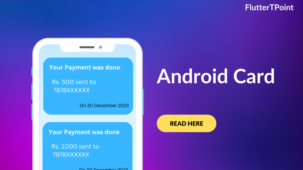
CardView is the view which can display the views on top of each other. It looks like a UI design. You can see this in many of the android applications.
Generally we can use it inside the Recyclerview in the android adapter’s class which shows the data in list format.
Androidx CardView
Following is the androidx CardView. The androidx Cardview is the also best widget.

Use the following code to create a CardView in your projects.
<?xml version="1.0" encoding="utf-8"?>
<LinearLayout xmlns:android="http://schemas.android.com/apk/res/android"
    xmlns:app="http://schemas.android.com/apk/res-auto"
    android:layout_width="match_parent"
    android:layout_height="match_parent"
    android:gravity="center_horizontal"
    android:orientation="vertical">

    <androidx.cardview.widget.CardView
        android:layout_width="match_parent"
        android:layout_height="wrap_content"
        android:layout_margin="15dp"
        android:elevation="5dp"
        app:cardCornerRadius="10dp">

        <androidx.appcompat.widget.LinearLayoutCompat
            android:layout_width="match_parent"
            android:layout_height="match_parent"
            android:orientation="horizontal"
            android:padding="10dp"
            android:weightSum="10">

            <androidx.appcompat.widget.LinearLayoutCompat
                android:layout_width="wrap_content"
                android:layout_height="wrap_content"
                android:layout_weight="7"
                android:orientation="vertical">

                <TextView
                    android:layout_width="wrap_content"
                    android:layout_height="wrap_content"
                    android:text="Title"
                    android:textColor="@color/black"
                    android:textSize="18dp"
                    android:textStyle="bold" />

                <TextView
                    android:layout_width="wrap_content"
                    android:layout_height="wrap_content"
                    android:text="Write The Description Here"
                    android:textColor="@color/black"
                    android:textSize="16dp"
                    android:textStyle="bold" />
            </androidx.appcompat.widget.LinearLayoutCompat>

            <ImageView
                android:layout_width="50dp"
                android:layout_height="50dp"
                android:layout_weight="3"
                android:src="@drawable/cartphoto" />
        </androidx.appcompat.widget.LinearLayoutCompat>
    </androidx.cardview.widget.CardView>

</LinearLayout>
Android Material CardView
You can use the android material design CardView which have more features then the androidx cardview. Before use the material designs any library first add the following dependency and do sync. In the latest android studio, it automatically added in the build.gradle file.
Add the dependency into the build.gradle(Module: your_app_name) file:
implementation 'com.google.android.material:material:1.4.0'
<?xml version="1.0" encoding="utf-8"?>
<LinearLayout xmlns:android="http://schemas.android.com/apk/res/android"
    xmlns:app="http://schemas.android.com/apk/res-auto"
    android:layout_width="match_parent"
    android:layout_height="match_parent"
    android:gravity="center_horizontal"
    android:orientation="vertical">

    <com.google.android.material.card.MaterialCardView
        android:layout_width="match_parent"
        android:layout_height="wrap_content"
        android:layout_margin="15dp"
        app:cardElevation="10dp"
        app:cardCornerRadius="10dp">

        <androidx.appcompat.widget.LinearLayoutCompat
            android:layout_width="match_parent"
            android:layout_height="match_parent"
            android:orientation="horizontal"
            android:padding="10dp"
            android:weightSum="10">

            <androidx.appcompat.widget.LinearLayoutCompat
                android:layout_width="wrap_content"
                android:layout_height="wrap_content"
                android:layout_weight="7"
                android:orientation="vertical">

                <TextView
                    android:layout_width="wrap_content"
                    android:layout_height="wrap_content"
                    android:text="Title"
                    android:textColor="@color/black"
                    android:textSize="18dp"
                    android:textStyle="bold" />

                <TextView
                    android:layout_width="wrap_content"
                    android:layout_height="wrap_content"
                    android:text="This is material cardview"
                    android:textColor="@color/black"
                    android:textSize="16dp"
                    android:textStyle="bold" />
            </androidx.appcompat.widget.LinearLayoutCompat>

            <ImageView
                android:layout_width="50dp"
                android:layout_height="50dp"
                android:layout_weight="3"
                android:src="@drawable/cartphoto" />
        </androidx.appcompat.widget.LinearLayoutCompat>
    </com.google.android.material.card.MaterialCardView>

</LinearLayout>
Thank you for visiting this tutorial on FlutterTpoint. Hope it helped you to create CardView.
Learn more Android Useful Tutorials which will improve your development skills. For any query and doubt you can comment in the comment section below.
Suggestions:
Linear Layout In Android Studio
Relative Layout in Android Studio With Examples
How to generate android debug apk for testing the app
CardView In Android Studio With Examples
Android Splash Screen Full Example
SQLITE Database In Android Studio Example
What is WebView In Android Studio
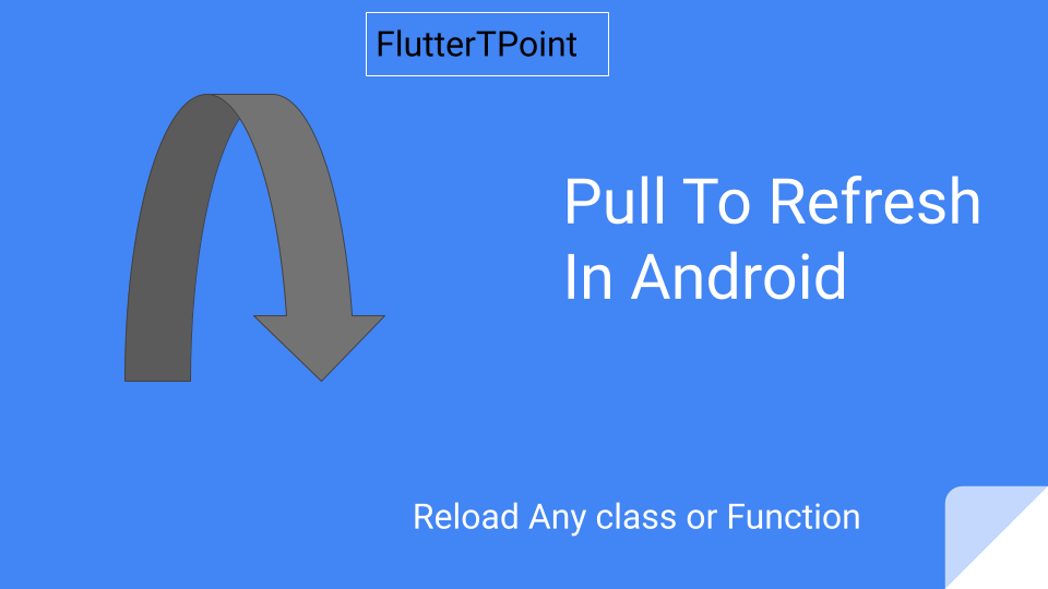
Pull To Refresh In Android Studio
Opening Camera In Android Studio Examples
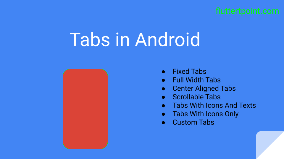
Tabs In Android Studio Example
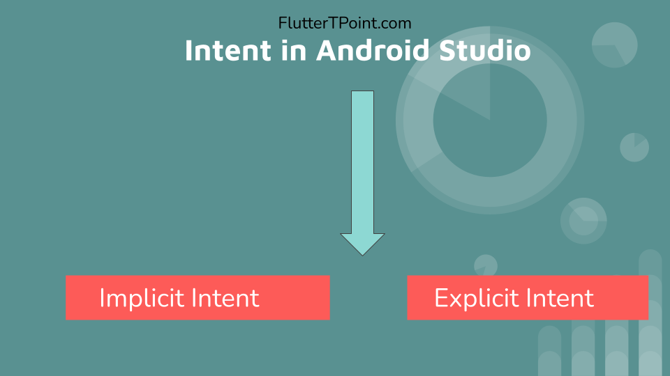
Intent In Android Studio With Examples
Creating Rounded Corner Button In Android Studio
Full Screen VideoView In Android Studio Example
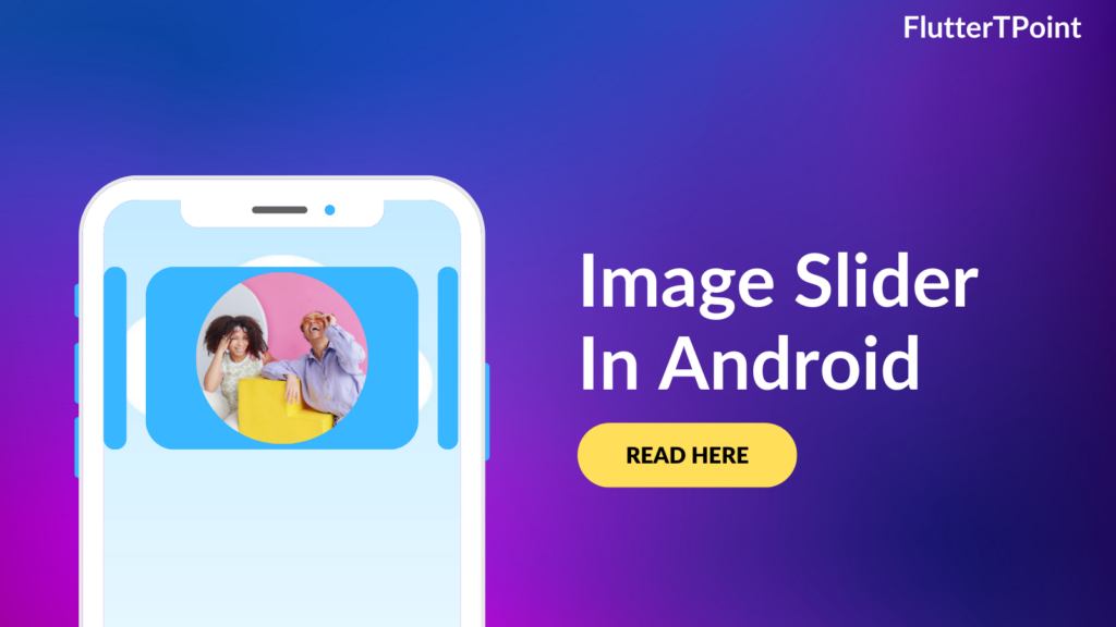
Auto Image Slider In Android Studio Example
Recyclerview in android Complete Example
Android DataBinding Example | Enable Data Binding in Android
Bottom Navigation Bar In Android
Navigation Drawer In Android Studio With Example | FlutterTPoint
Why String are immutable in Java Full Explanation